
Role
UX & UI & Interaction Designer
Activities
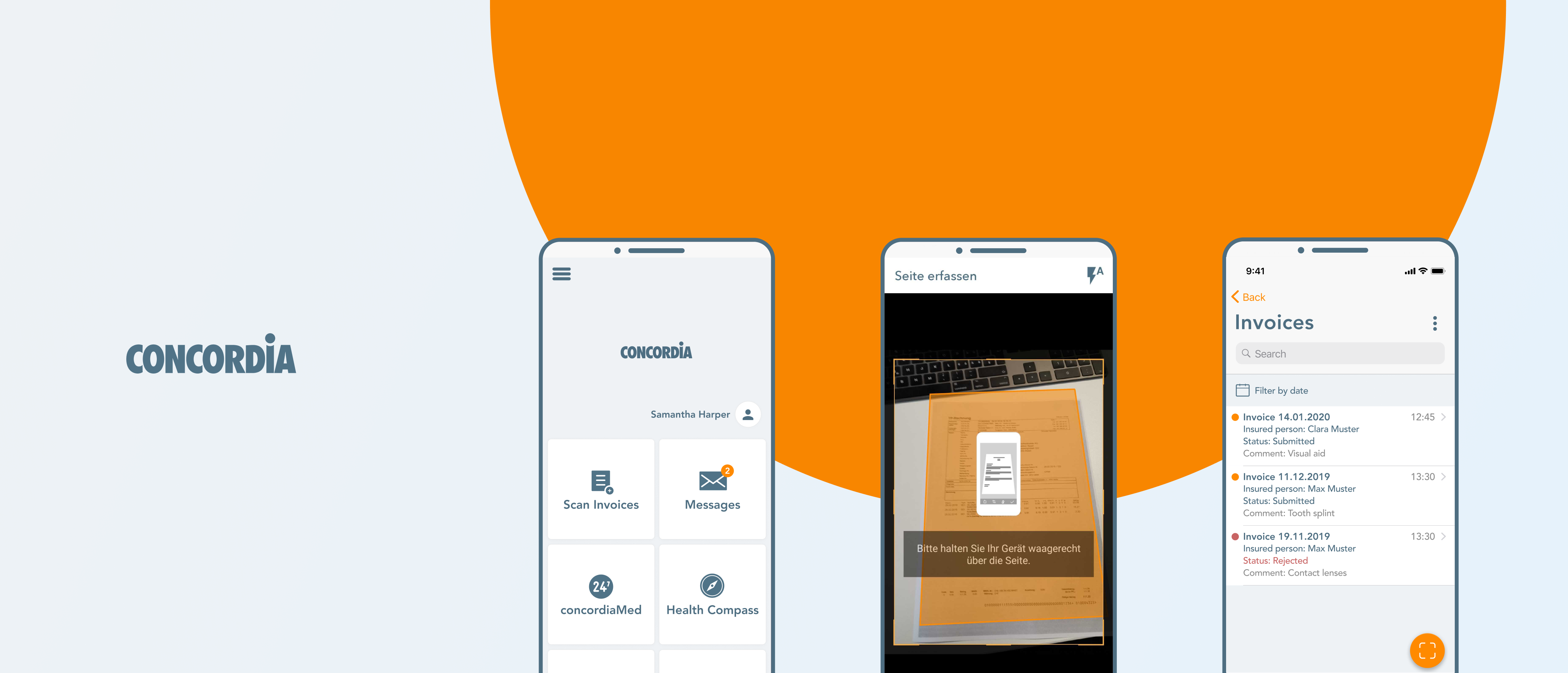
I was responsible for designing and conceptualizing a new insurance mobile app and web portal for CONCORDIA. I led the digital brand direction across both mobile and web.
Concept,
UI Design,
Prototypes,
Usability Tests,
Guidelines for Design System
Tools
Pen & Paper
Figma
InVision
Team
Distributed Team - Zurich, Lucerne - Team of 7 (1 UX, 4 Devs, PM, PO)
Achivement
Created an app with following goals successfully achieved:
The app was designed for iOS, Android


For years, CONCORDIA's customers had to hand in their medical invoices in an old fashioned way by mail. While competitors updated the process by providing a mobile app service to scan and easily submit invoices. To catch up with the competitors and give CONCORDIA customers a better user experience, we analyzed their current process and ecosystem to combine their existing customer platforms and services in one easy to use app. This helped users to have a clear overview of all medical services and to be able to capture and submit their invoices.
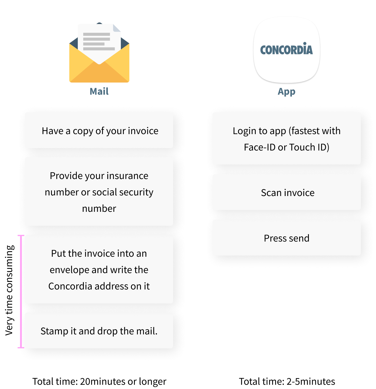
CONCORDIA is one of the largest insurance company in Switzerland and currently, customers have to hand in their
medical invoices by snail mail. Customers have to create their own copy of their invoice, putting the original
copy into an envelope, getting a post stamp and dropping it into a mailbox. Afterward, the customers then
need to wait until they receive a confirmation mail by CONCORDIA if the bill will be covered or not.
To overcome this tedious process, the new app should simplify those steps. In addition, we'd like to provide customers
more transparency about their health insurance situation and a platform where they can easily reach out to CONCORDIA.
After interviewing current Concordia customers and analyzing the workflow,
we saw that all steps can be very time-consuming. Often people have to search for their insurance number
since it is too long to memorize. Organizing an envelope and stamp comes with low cost but when unavailable, making a trip to the next
stationery store or kiosk is inevitable.
Also searching for the mailbox address of CONCORDIA can be quite tedious. This repetitive long procedure can easily demotivate
people to hand in their invoices and postpone it to never o' clock.
With the new app solution, all these steps are simplified and automated to save time, paper and money. An
invoice can now be submitted in just 3 very short steps and within 2-5 minutes.

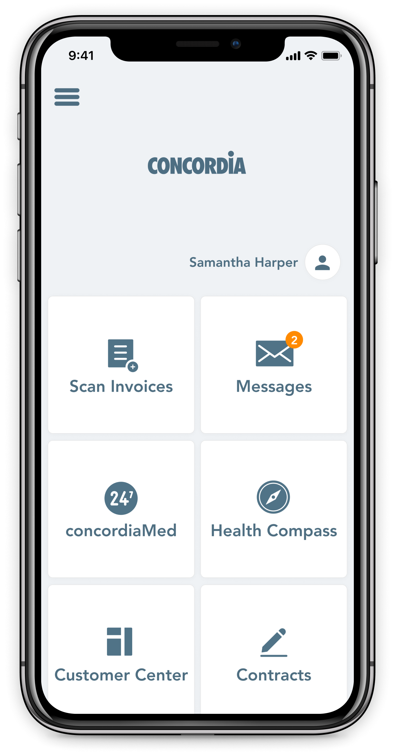
First, I quickly sketched rough ideas of the main flow to help with discussions and open up the conversation with team members and stakeholders. I involved the PM and PO to visualize the first vision based on their inputs and our shared understanding of the problem space. Sketching some important screens and flows helped to make first decisions on what technology and which frameworks to use and estimate costs. By discussing the flows and features of the app with engineers, we decided to have a mix of native views and Webviews. Some features that we wanted to provide in the app were already available on the web-based customer platform. By optimizing the web platform for mobile, we were able to save implementation and maintenance costs.
Since the entire project had to be released just in 8 months, I tried to provide a clickable hi-fi Prototype as early as possible to test the design. In the test, the goal was to validate our hypotheses and very our information architecture in order to confidently execute the implementation. The Prototype was designed in Figma and then exported to InVision.
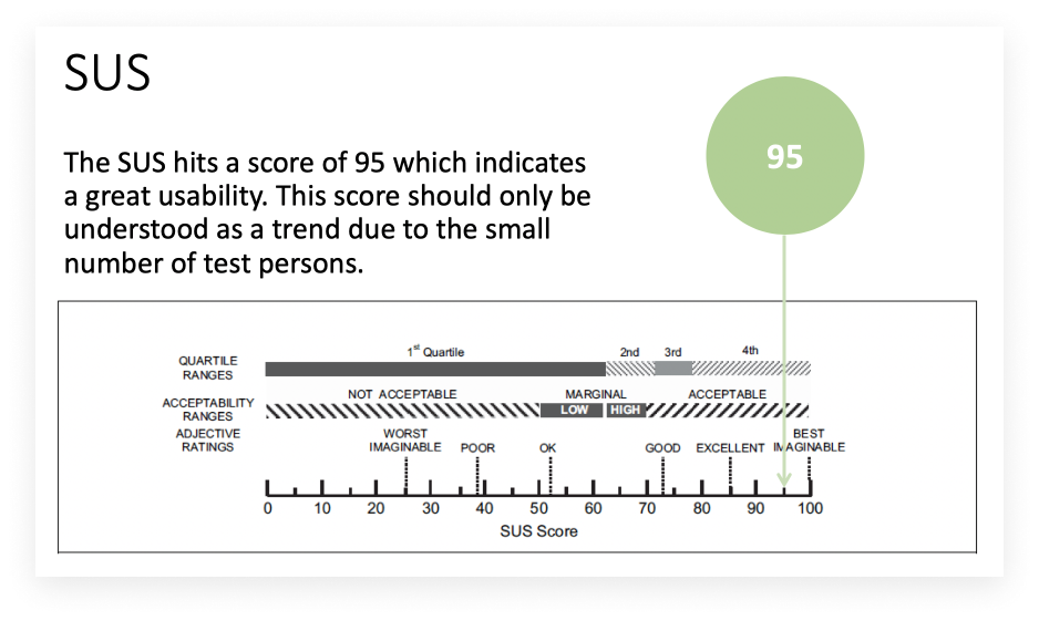
To measure the usability of the app I used the System Usability Scale (SUS) and gave the users some tasks to complete. I had four test users; two of them were already using an insurance scanning app, one who only uses the desktop to complete tasks, and a person who only uses a classic mailing method to send invoices. In addition we also wanted to validate the IA, design perception and copy text.
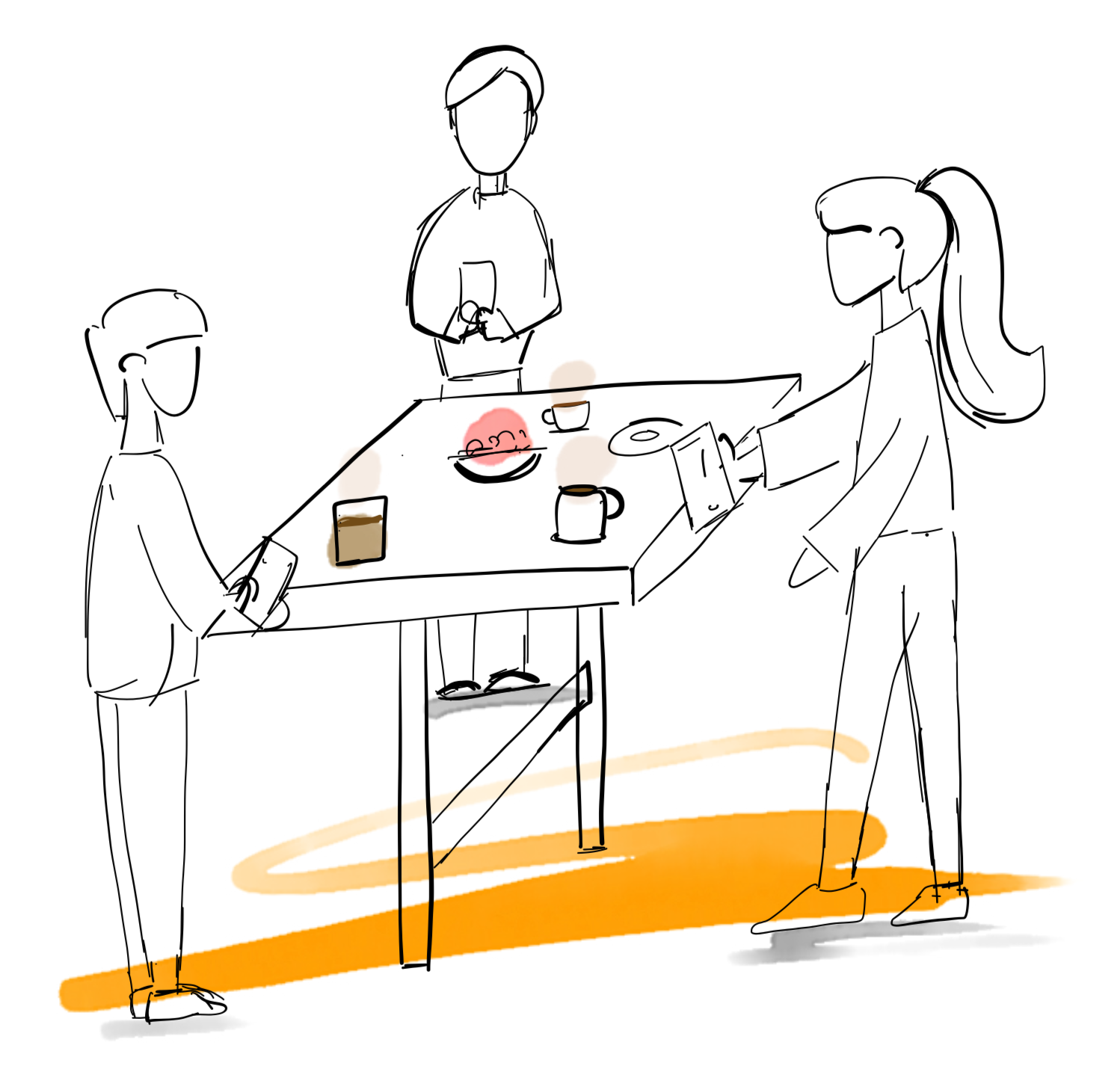
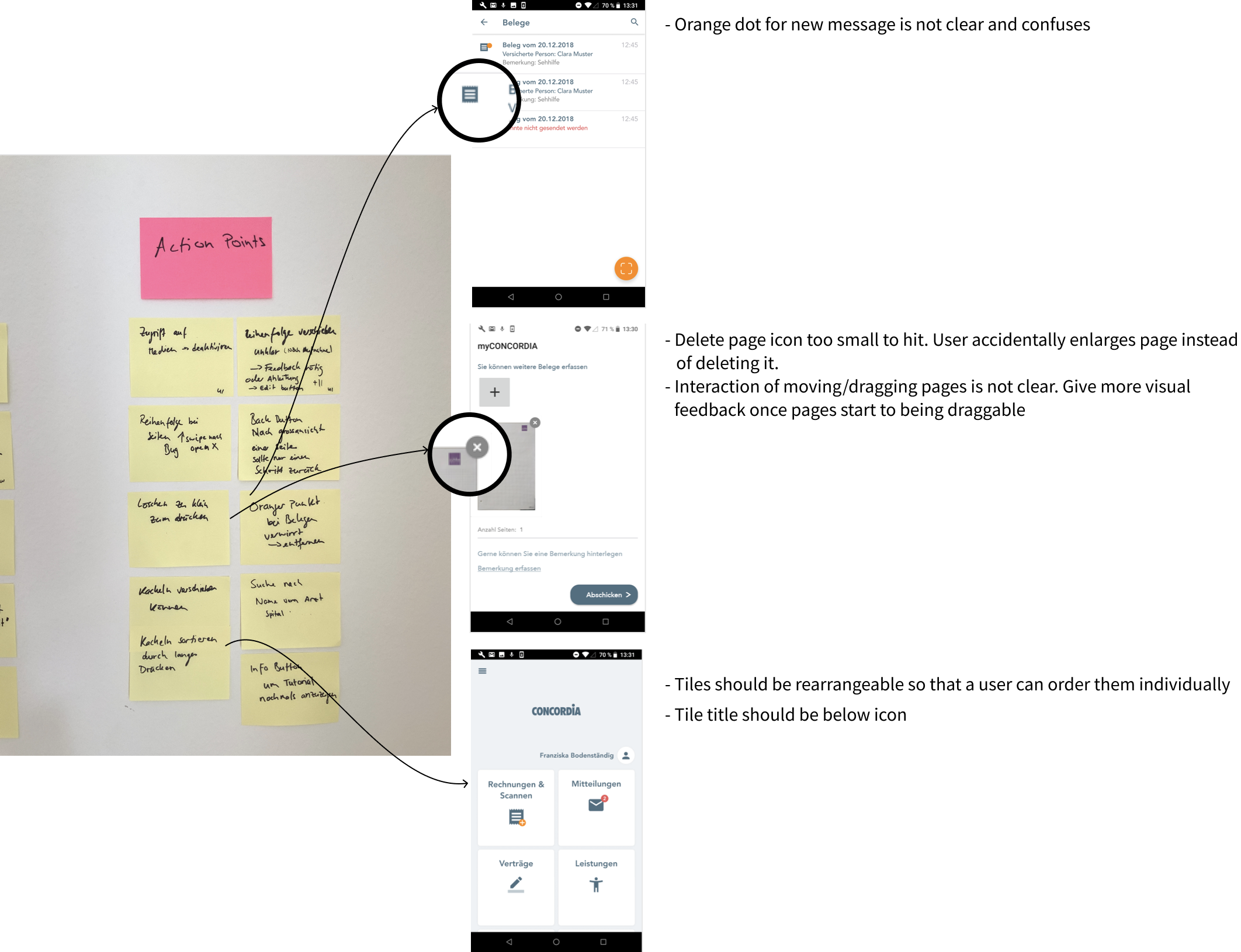
Testing Cafe: To assure the quality of the app, our cross-functional team got together at our inhouse cafe on a weekly basis to test the app. We tested the current state of the app for about 30 min to one hour. The cafe helped to create a friendly and chill environment. We wrote down all the bugs and UX flaws and prioritized tasks. The testing cafe helped everyone to see how each individual work contribution fit together and what still needs to be done or fixed.
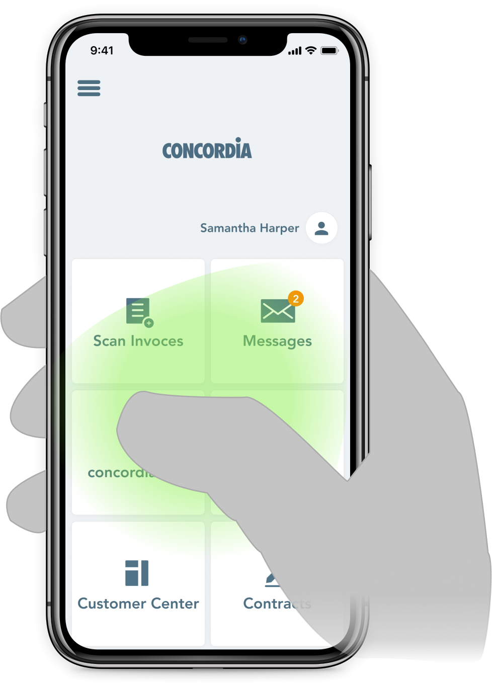
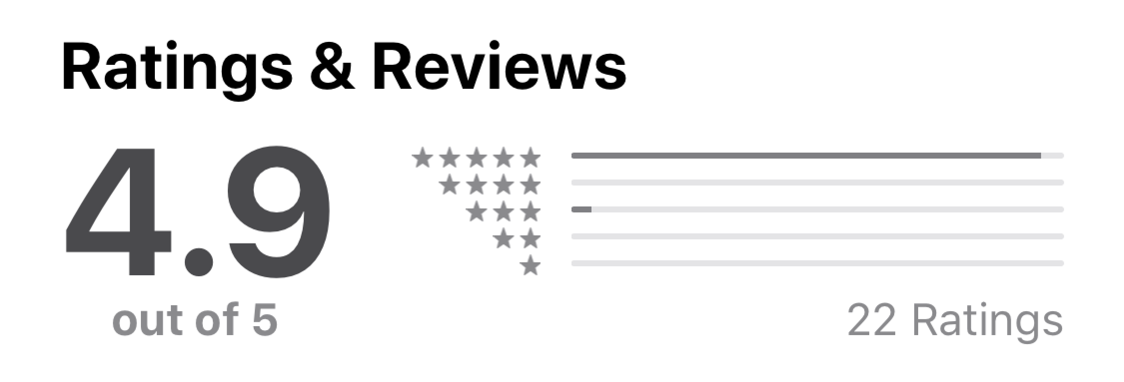
Shortly after its release, the MyConcordia App ranked #1 in the Swiss App Store.
